Appearance
Dashboard builder
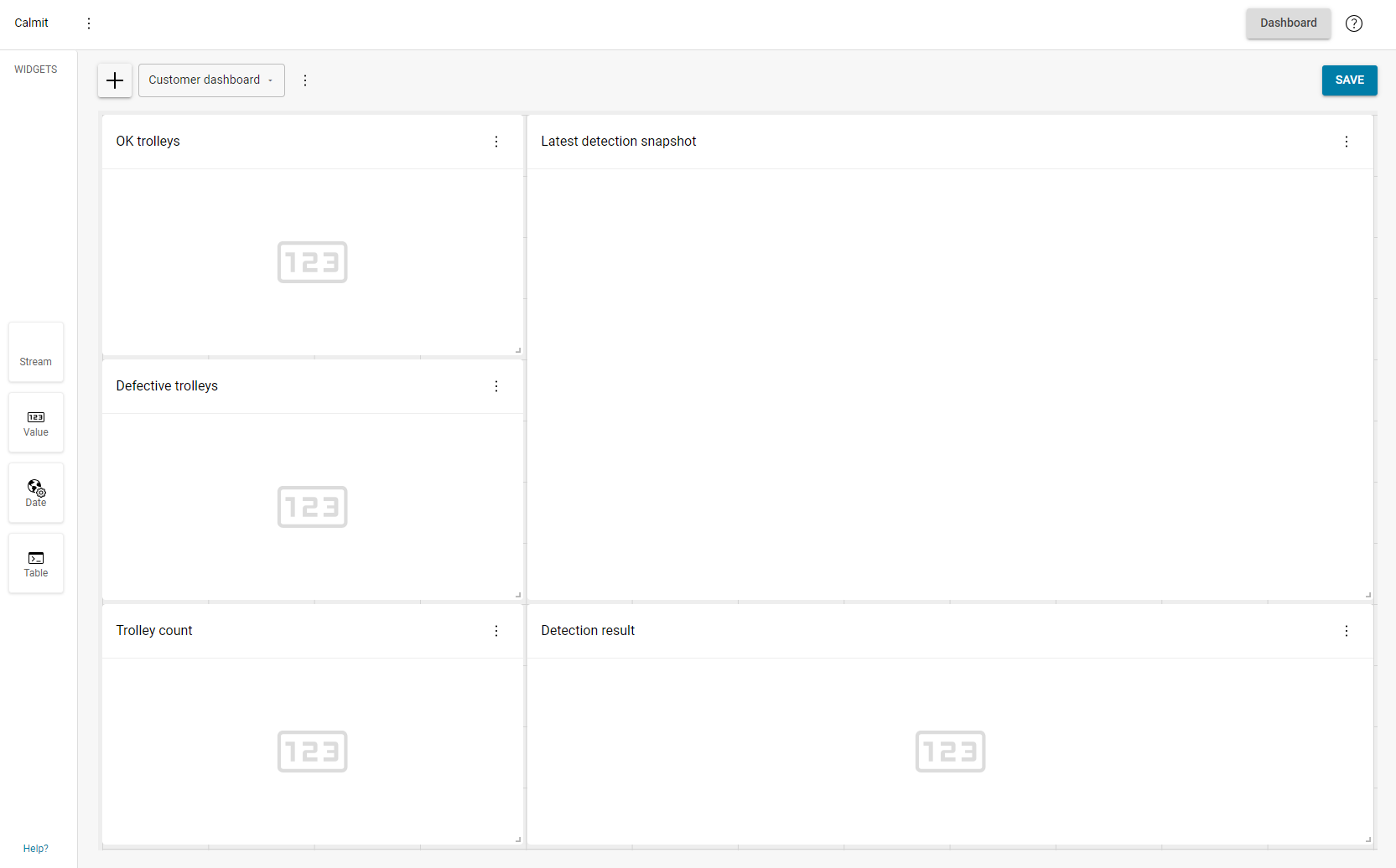
The Dashboard Builder enables the creation of dashboards, customization of dashboard widgets and layout based on specific requirements. It provides control over the arrangement and selection of various tiles that display live data, images, and statistics relevant to production monitoring.
Create a dashboard
To create a dashboard, follow these steps:
Click the ➕ button to create a new dashboard.
Enter a name and an optional description.
Click Create to save the dashboard.
⚠️ Warning
Any actions and changes made in the editor need to be saved by clicking the Save button.
Widgets
Widgets display various types of data, offering a customizable way to present information based on specific needs.
Add Widget
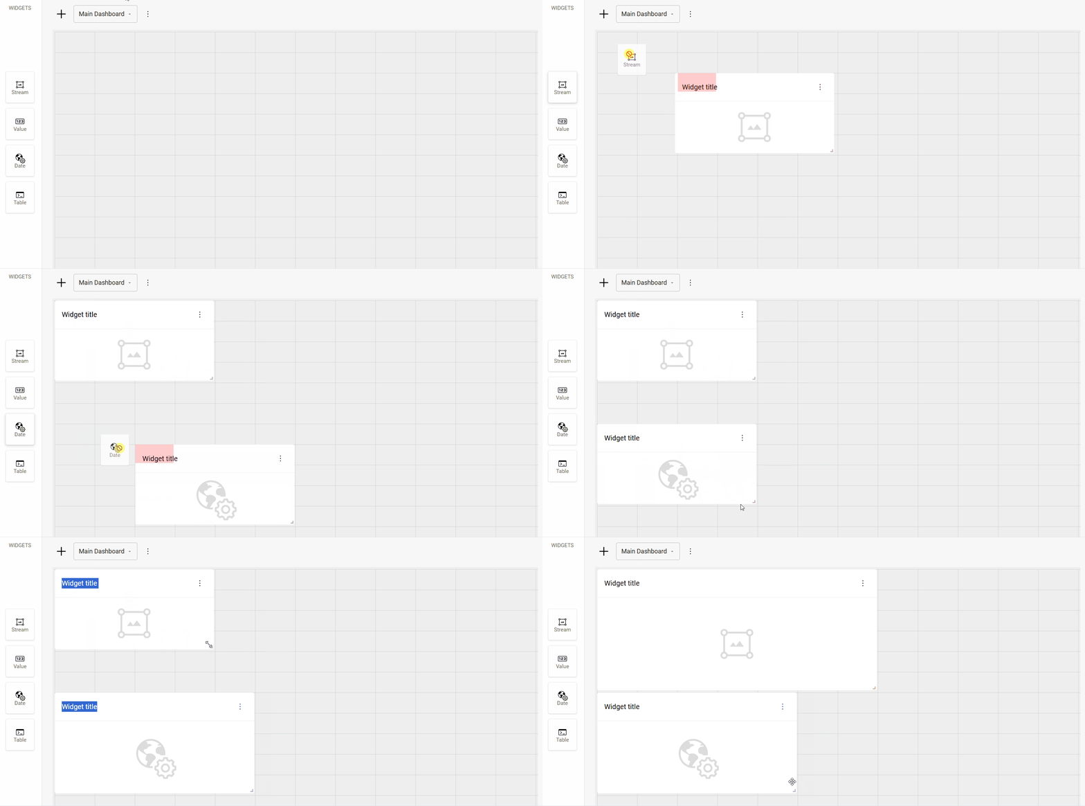
To add a widget to the dashboard, select a widget and drag it to the canvas on the right, then resize it to the desired dimensions.
💡 Tip
The widget selection and layout are determined by the specific customer requirements and needs.
Each dashboard is limited to 9 widgets. To add more, create additional dashboards.
Widget types
Stream widget
Displays a live stream of the camera or a still image of the product whenever a detection is triggered.
Supported output types: Image, SVG image.
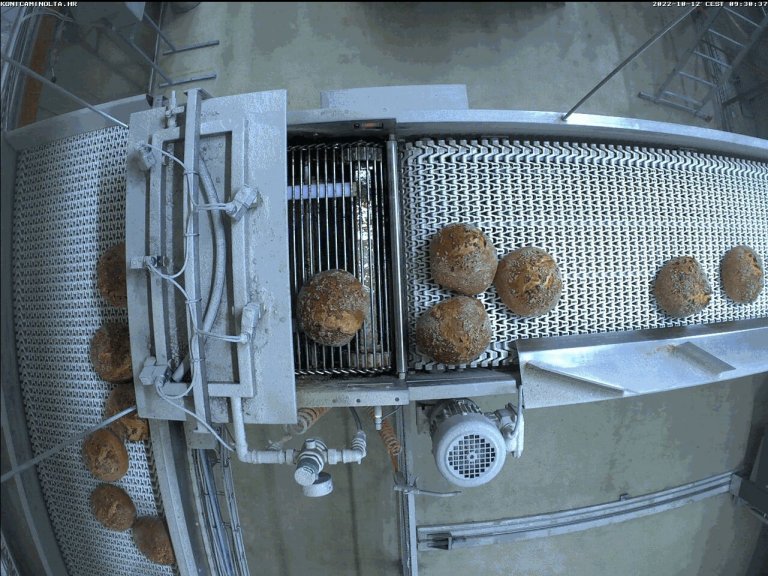
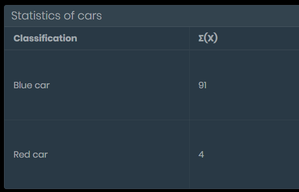
Table widget
Displays statistical information in a table.
Supported output types: Table.
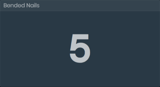
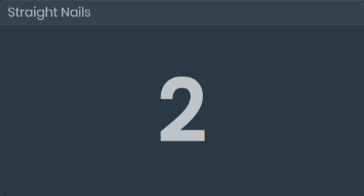
Value widget
Displays dynamic values (text or number).
Supported output types: Number, string, boolean.
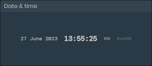
Date & time widget
Displays the current date, time, week, and the local time zone.
Configure Widgets
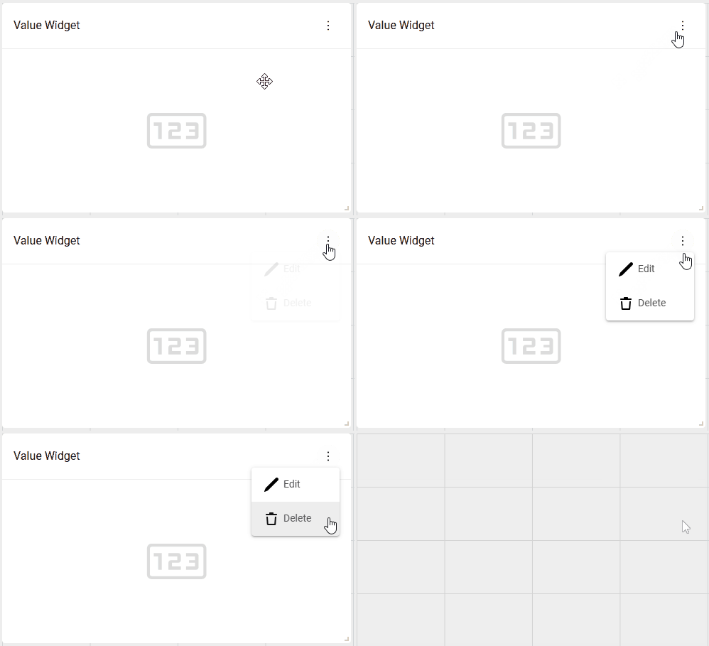
To configure the widgets, click the three-dot menu in the upper right corner of the widget, then click the Edit button.
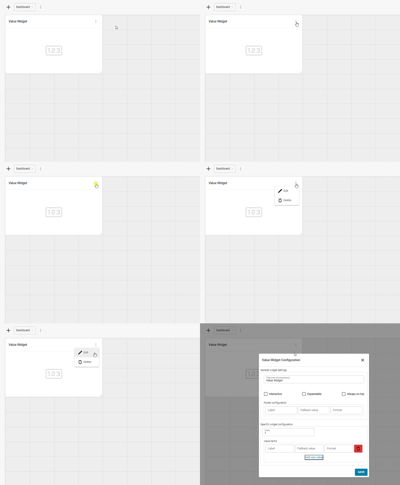
General widget settings
This section outlines the settings that are available for every widget:
Title Sets the header title for the widget
Expandable Allows the widget to expand to fullscreen when clicked on the customer dashboard.
Always on top Keeps the widget visible on top of other widgets when they are expanded.
Footer configuration
Label
Optional label displayed on the left side of the footer.Fallback value
Displays a fallback value when the source for the widget is unavailable or fails to provide data. For example, if you put in “N/A”, when the value source fails to provide data, the footer will display “N/A”.Format
Utilizes sprintf to format the footer value. Refer to the official cplusplus manual for details.
Examples:
%.2f - displays the output with 2 digits after the decimal point.
Ex: 1.45674 → 1.45
%d%% - displays a % symbol after the value
Ex: 24 → 24%
%d - displays a whole number with no decimals
Ex: 12.865 → 12
Specific widget settings
This section covers settings that apply only to specific widgets.
Value widget
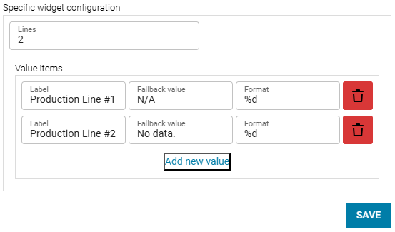
Lines
Sets the number of date entries to be displayed at once. If the number of items in the widget exceeds the number of available lines, the content becomes scrollable.Label
Optional label for the value displayed inside the widget.Fallback value
Displays a fallback value when the source for the widget is unavailable or fails to provide data.
For example, if you put in “N/A”, when the widget source fails to provide data, the value widget will display “N/A”.Format
Utilizes sprintf to format the Value widget output. Refer to the official cplusplus manual for details.
Examples:- %.2f - displays the output with 2 digits after the decimal point.\ 1.45674 → 1.45 - %d%% - displays a % symbol after the value.\ 24 → 24% - %d - displays a whole number with no decimals.\ 12.865 → 12
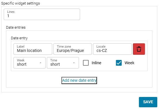
Date & Time widget
Lines
Sets the number of date entries to be displayed.Label
Custom label, displayed below the date.Time zone
Sets the time zone of the widget. Use the timezone database ('TZ identified' column) to enter the correct format.Locale
Changes the format of the date. Accepted entries: default , cs-CZ.- default - Displays the date as Month/Day/Year (US format). - cs-CZ - Displays the date as Day/Month/Year.Week
Sets the long or short format for the date.- Example:\ Long - April 29th, 2019\ Short - 29/04/2019Time
Sets the long or short format for the time.- Example:\ Long - Displays hours, minutes, and seconds.\ Short - DIsplays hours and minutes.Inline
Displays all the data in a single line.Week (checkbox)
Toggles the visibility of the number of the week in a year.
Delete Widget
To delete a widget, click the three-dot menu in the upper right corner of the widget, then click the Delete button.